The page you are looking for has either moved or been retired!
In 2022 this website was updated, and some webpages either changed locations or were retired. Below are some links which may help you find what you are looking for, or more current work in the same vein:
- You can check the Internet Archive for this site, which has archives dating back to 2001
- All /illustration/ URLs were retired. Please check out my illustration portfolio website for my current illustration work
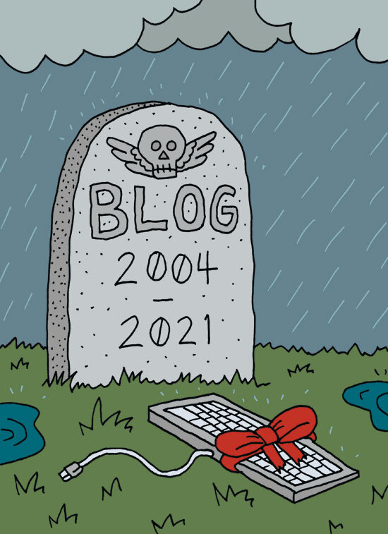
- All /blog/ URLs were retired. Please check out the news section of this site for current updates
If you still can't find what you are looking for, feel free to drop me a line and I'll do my best to help you track it down.